60 Wedding Color Palette Ideas for Every Season
Disclosure: Some of the links in this post are affiliate links. This means if you click on the link and purchase an item, I will receive an affiliate commission at no extra cost to you.
Choosing your wedding colors is one of the most exciting parts of planning your celebration. The right combination can bring your flowers, bridesmaid dresses, table settings, and venue decorations together beautifully.
The season can also help you decide which colors will work best for your wedding. Spring often suits fresh pastels, summer welcomes bright and cheerful shades, autumn looks beautiful with warm earthy tones, and winter pairs well with deeper colors and elegant metallics.
If you are still planning your reception details, explore 75 Luxury Wedding Reception Ideas for inspiration on bringing your chosen colors into your celebration.
Spring Wedding Color Palettes
1. Blush Pink and Ivory
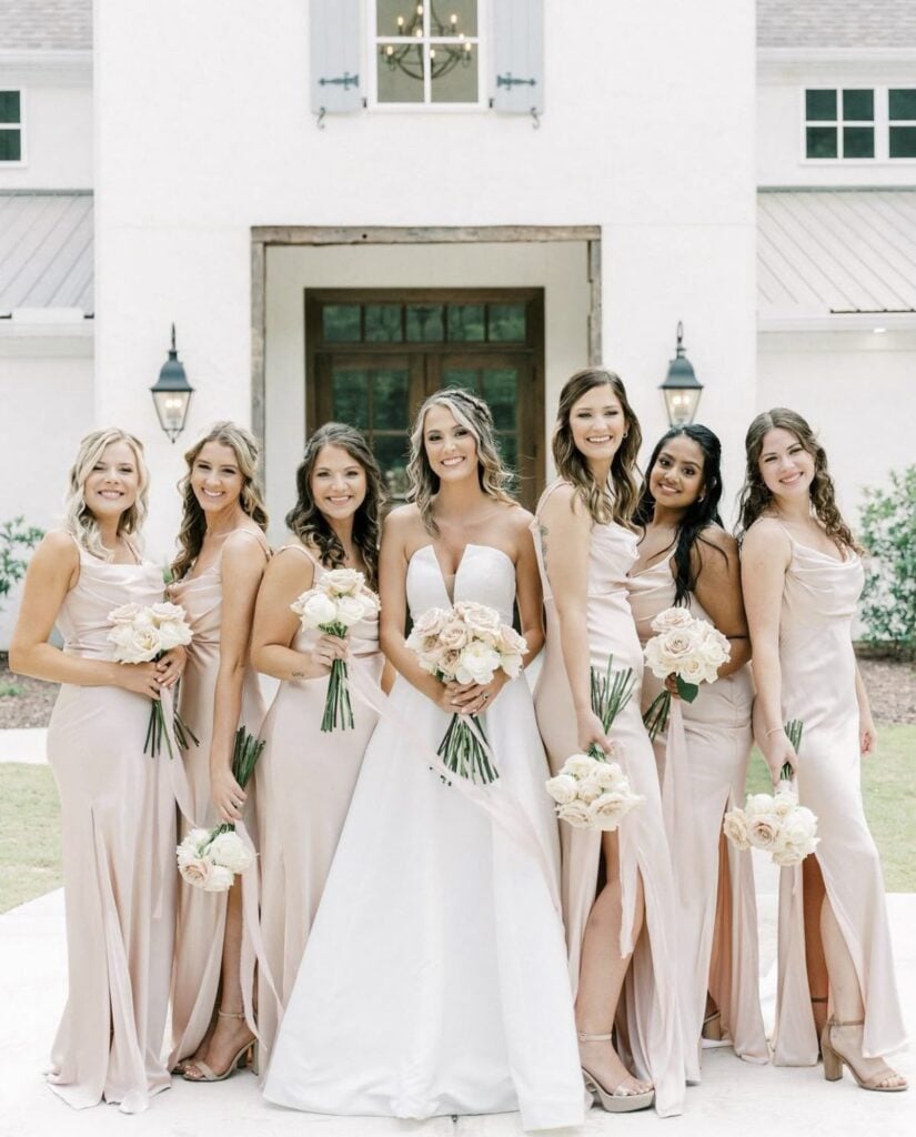
Blush pink and ivory create a soft, romantic palette that works beautifully for spring weddings.
Use blush flowers with ivory linens, or introduce the colors through bridesmaid dresses and table decorations. Add a little greenery to keep the overall look fresh.
Bookmark this for later: 100 Elegant Wedding Decor Ideas You’ll Want to Save
2. Sage Green and Champagne
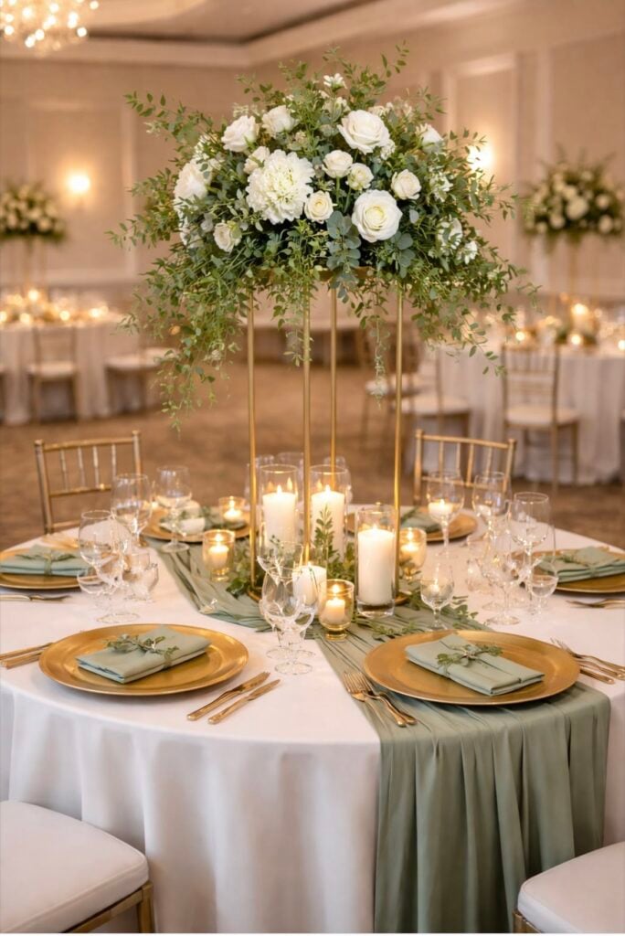
Sage green and champagne offer an elegant combination for couples who love natural colors.
It also works well for bridesmaid dresses, greenery, and stationery, while champagne adds warmth through table linens and metallic accents.
This palette suits garden weddings and elegant indoor celebrations.
Save this idea for your wedding: How to Choose a Wedding Photographer
3. Lavender and Dusty Blue
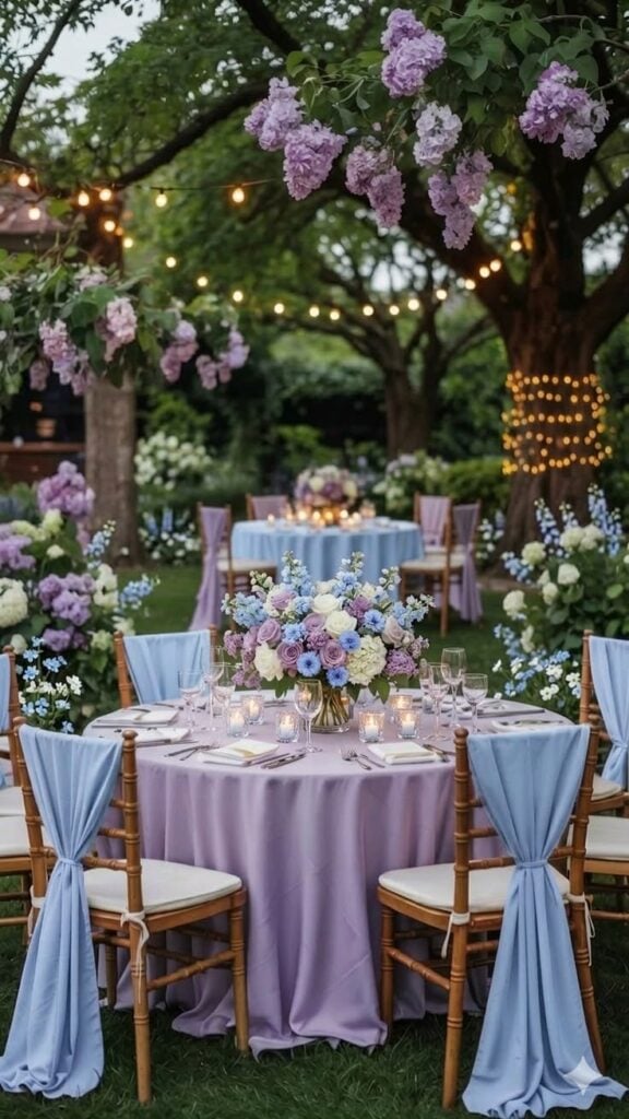
Lavender and dusty blue create a gentle palette that feels fresh without being too bright. Use lavender flowers alongside dusty blue dresses or table details for a balanced look.
White accents can help both colors stand out.
4. Peach and Cream
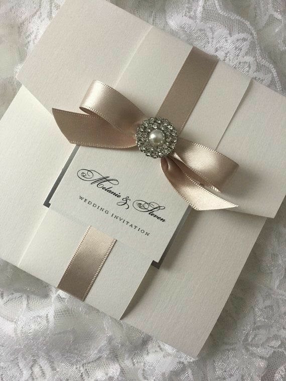
Peach and cream bring warmth to a spring wedding while keeping the overall design light. These shades look lovely in floral arrangements, invitations, and reception centerpieces.
Add soft greenery for a natural finish.
Pin this for wedding inspiration: The Hidden Reason Weddings Go Over Budget
5. Butter Yellow and White
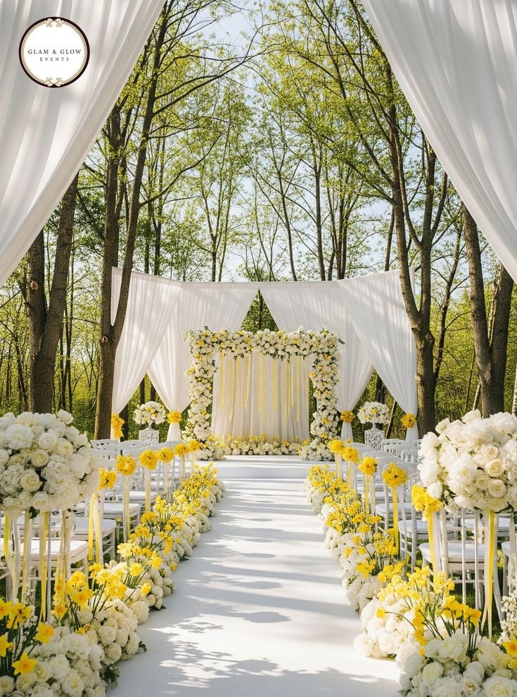
Butter yellow and white create a cheerful palette that feels especially lovely for daytime weddings.
Yellow flowers can brighten white table settings, while pale yellow details add warmth without overwhelming the design.
This combination works well for garden ceremonies and outdoor receptions.
Save this for your big day: 15 Luxury Wedding Bouquet Ideas to Fall In Love With
6. Dusty Rose and Mauve
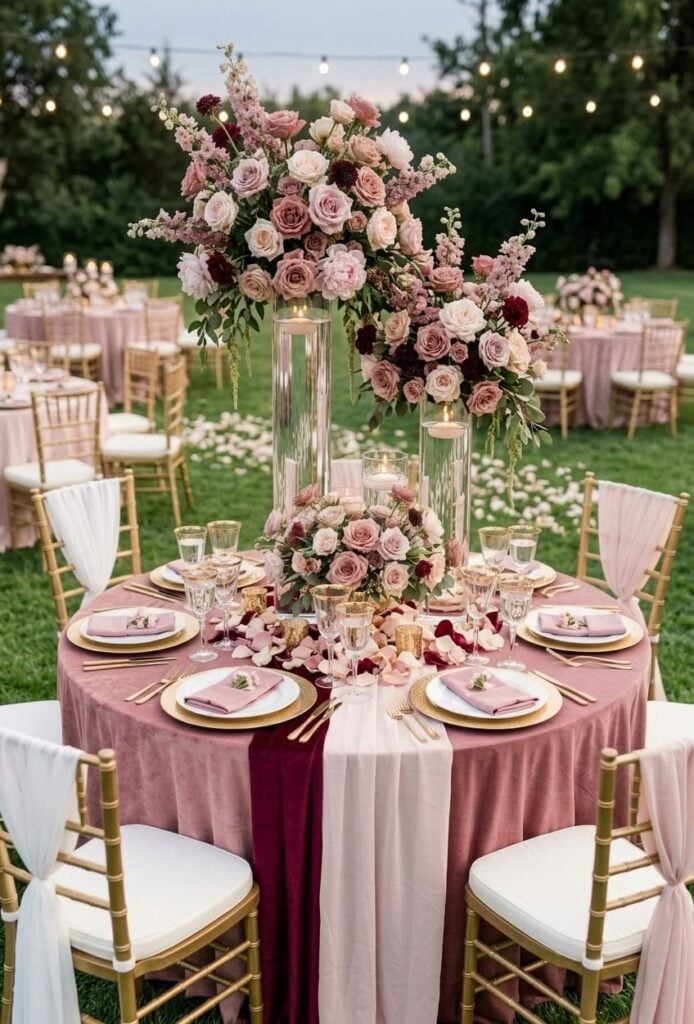
Dusty rose and mauve offer a romantic combination with a little more depth than traditional pastel pink.
Use dusty rose as the main color and introduce mauve through flowers, dresses, or stationery. Neutral shades such as cream can keep the palette balanced.
Add this to your wedding inspiration board: The Ultimate Wedding Planning Checklist From Engagement to “I Do”
7. Mint Green and Peach
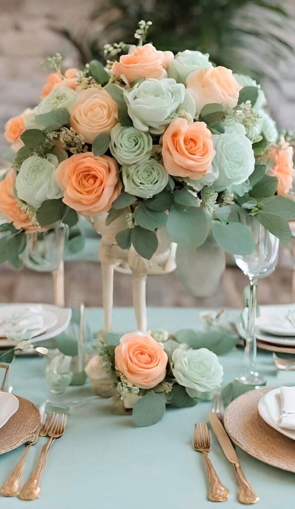
Mint green and peach create a playful yet elegant spring palette. It brings a fresh feeling, while peach adds warmth to bouquets, table settings, and decorative details.
Keep the surrounding colors simple so the combination feels coordinated.
Come back to these ideas later: How to Plan a Wedding Step by Step for Beginners
8. Lilac and Sage Green
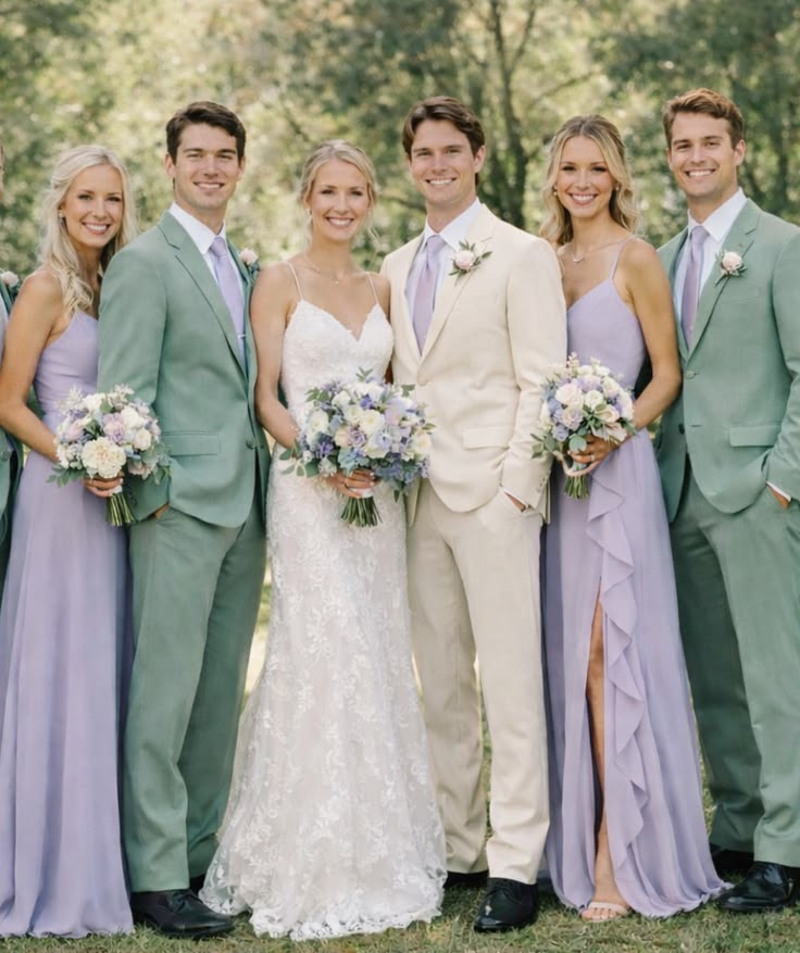
Lilac and sage green work beautifully for a wedding inspired by nature. sage green connects the decorations to the outdoor surroundings while Lilac flowers provide a soft pop of color.
This palette is particularly suitable for garden venues and spring celebrations.
Keep these ideas handy: How to Save Money for Your Wedding Without Sacrificing Style
9. Sky Blue and Ivory
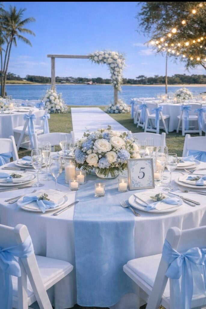
Sky blue and ivory create a light, timeless look that feels calm and romantic. Incorporate sky blue into bridesmaid dresses, napkins, or stationery, then use ivory flowers and linens to balance the design.
A few silver accents can add a polished finish.
Save this before you start planning: How to Create a Realistic Wedding Budget
10. Coral and Soft Pink
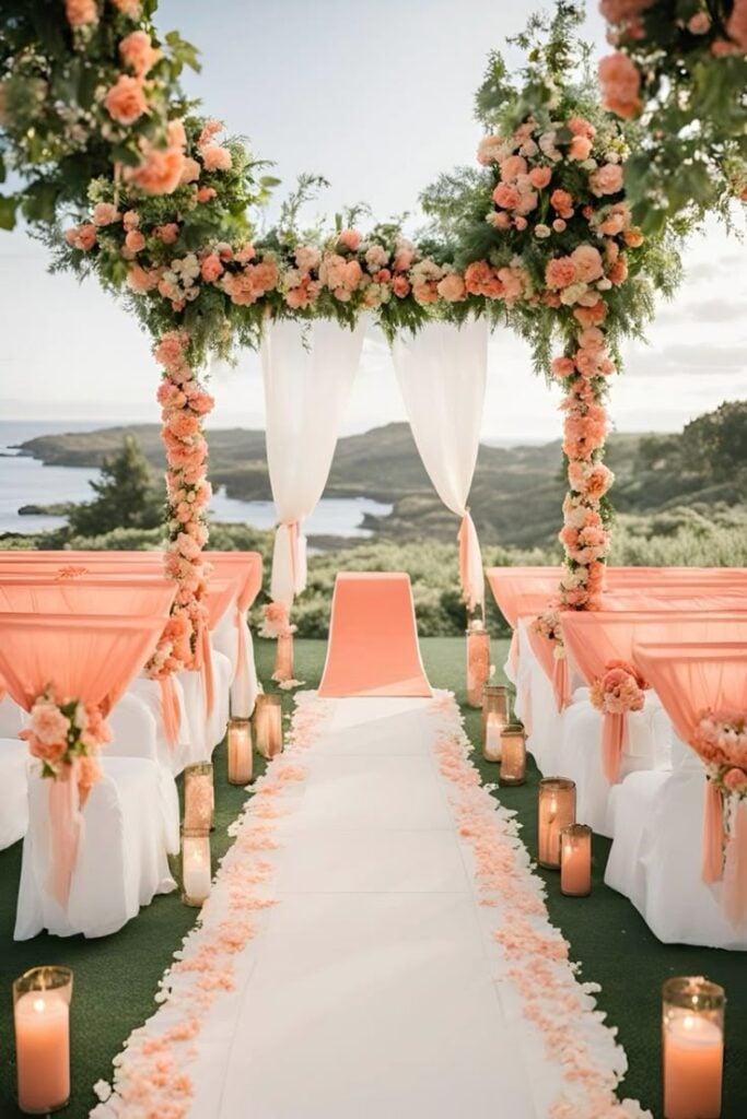
Coral and soft pink bring a little more brightness to a spring wedding. Combine coral flowers with soft pink decorations, or use coral as an accent against a mostly neutral background.
This palette works well for couples who want a cheerful celebration without using too many bold colors.
Show this to your partner: Wedding Expenses Couples Forget to Budget For
Summer Wedding Color Palettes
11. Terracotta and Dusty Rose
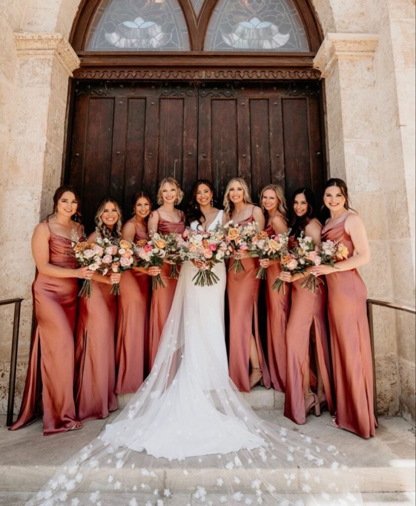
Terracotta and dusty rose combine earthy warmth with romantic softness.
Use terracotta in table decorations, signage, or bridesmaid accessories, then introduce dusty rose through flowers and linens. Cream details can help the palette feel lighter for summer.
12. Coral and Peach
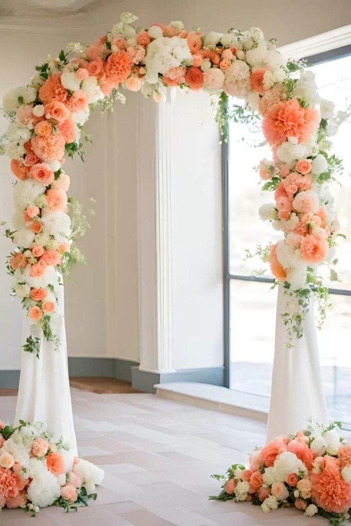
Coral and peach create a warm, lively palette that suits sunny outdoor weddings. These shades look beautiful in bouquets, centerpieces, and reception decorations.
Pair them with ivory or soft green to prevent the overall look from becoming too bright.
13. Cobalt Blue and White
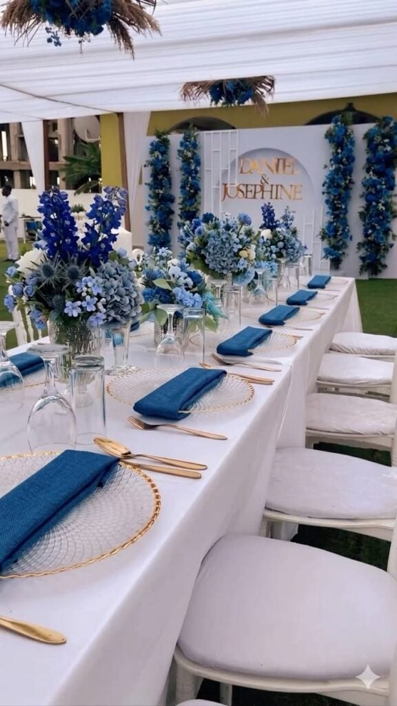
Cobalt blue and white create a striking combination for a summer celebration. Use cobalt in table accents, stationery, or bridesmaid dresses, then balance it with crisp white flowers and linens.
This palette is especially attractive for coastal and modern weddings.
14. Emerald Green and Gold
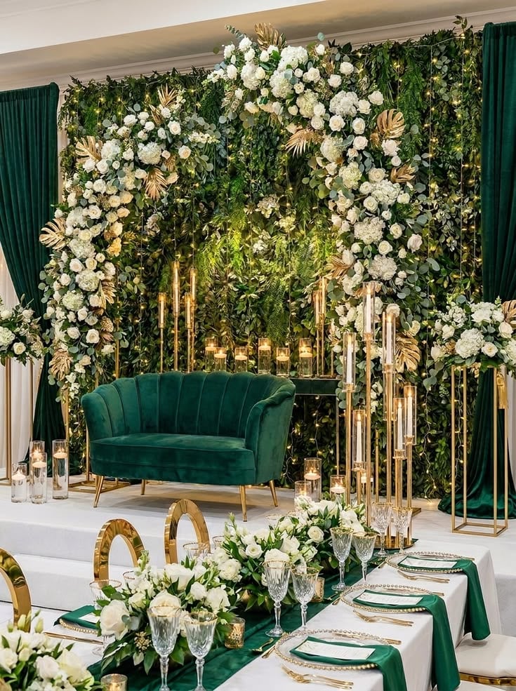
Emerald green and gold offer a rich, glamorous look that works well for both indoor and outdoor receptions.
You can also use emerald on dresses, foliage, or table linens, while gold adds a refined touch through cutlery and candle holders. Use the metallic accents sparingly for a balanced result.
15. Fuchsia and Orange
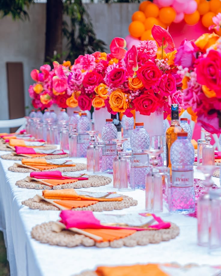
Fuchsia and orange are ideal for couples who love bold, energetic colors. Combine bright flowers with simpler table settings so the palette remains intentional.
White or cream details can provide a little visual breathing room.
16. Lemon Yellow and Sage Green
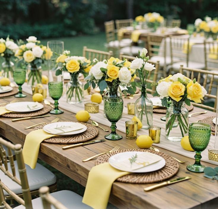
Lemon yellow and sage green create a fresh palette inspired by summer gardens. Use yellow flowers or small decorative accents alongside sage linens and greenery.
The result feels cheerful while remaining soft enough for an elegant celebration.
17. Navy Blue and Blush Pink
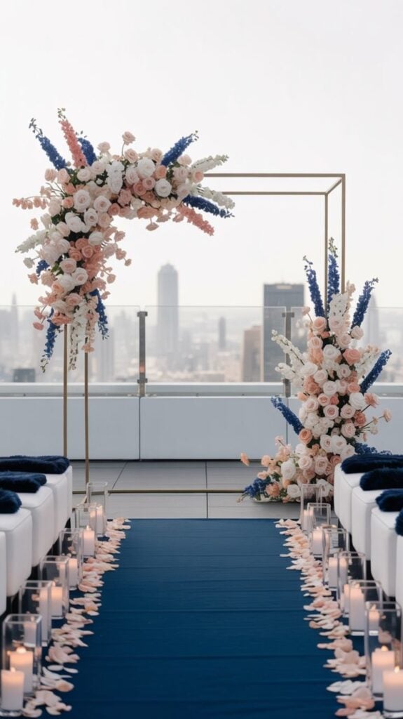
Navy blue and blush pink balance a deep, classic shade with a romantic pastel. Table accents, navy suits, or stationery can provide contrast, while blush flowers soften the overall look.
Ivory details help connect the two colors.
18. Turquoise and Coral
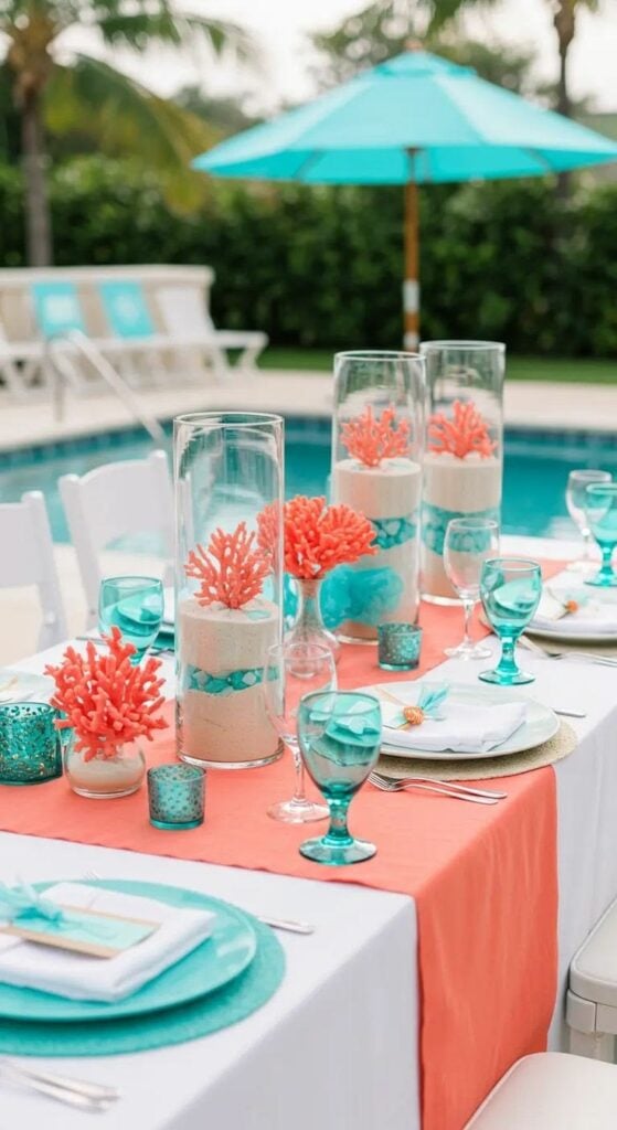
Turquoise and coral bring a bright, tropical feeling to summer weddings. Use turquoise in small decorative details and coral in bouquets or floral centerpieces.
This palette works particularly well for beach celebrations and outdoor receptions.
19. Lavender and Butter Yellow
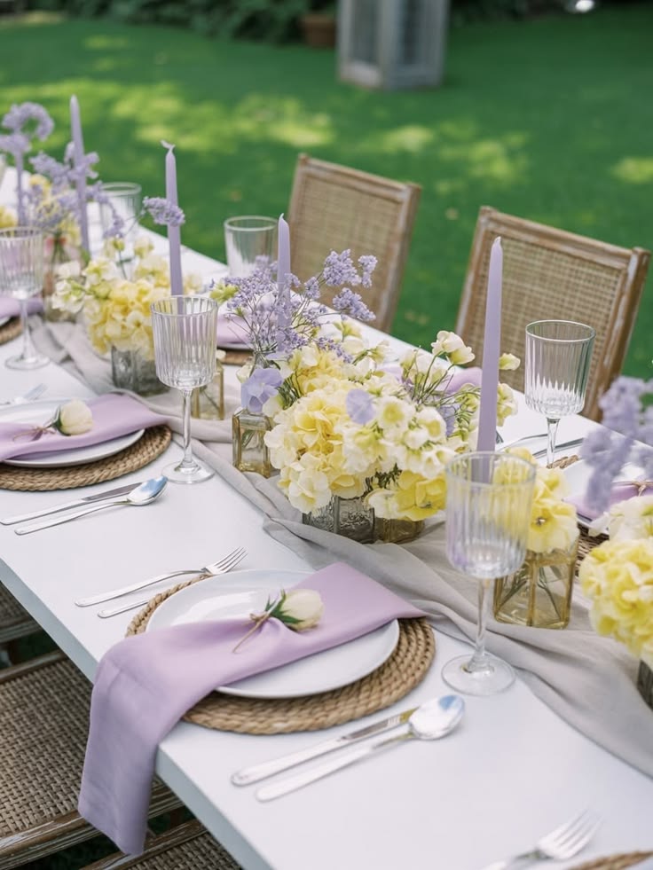
Lavender and butter yellow combine two soft shades for a cheerful summer palette.
Use lavender flowers with pale yellow accents in the table settings or stationery. White linens can help the colors remain fresh and elegant.
20. Olive Green and Cream
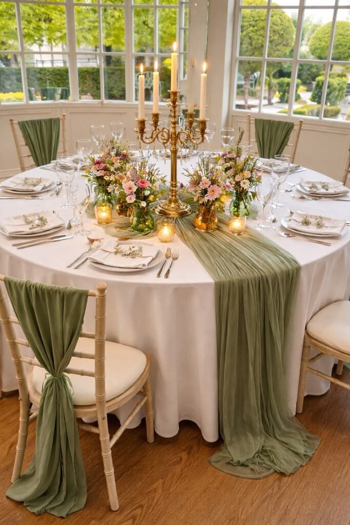
Olive green and cream create a natural, understated palette for couples who prefer earthy colors.
You can also use olive in foliage, table runners, and stationery, while cream adds softness through flowers and linens. This combination suits rustic venues, vineyards, and garden receptions.
Autumn Wedding Color Palettes
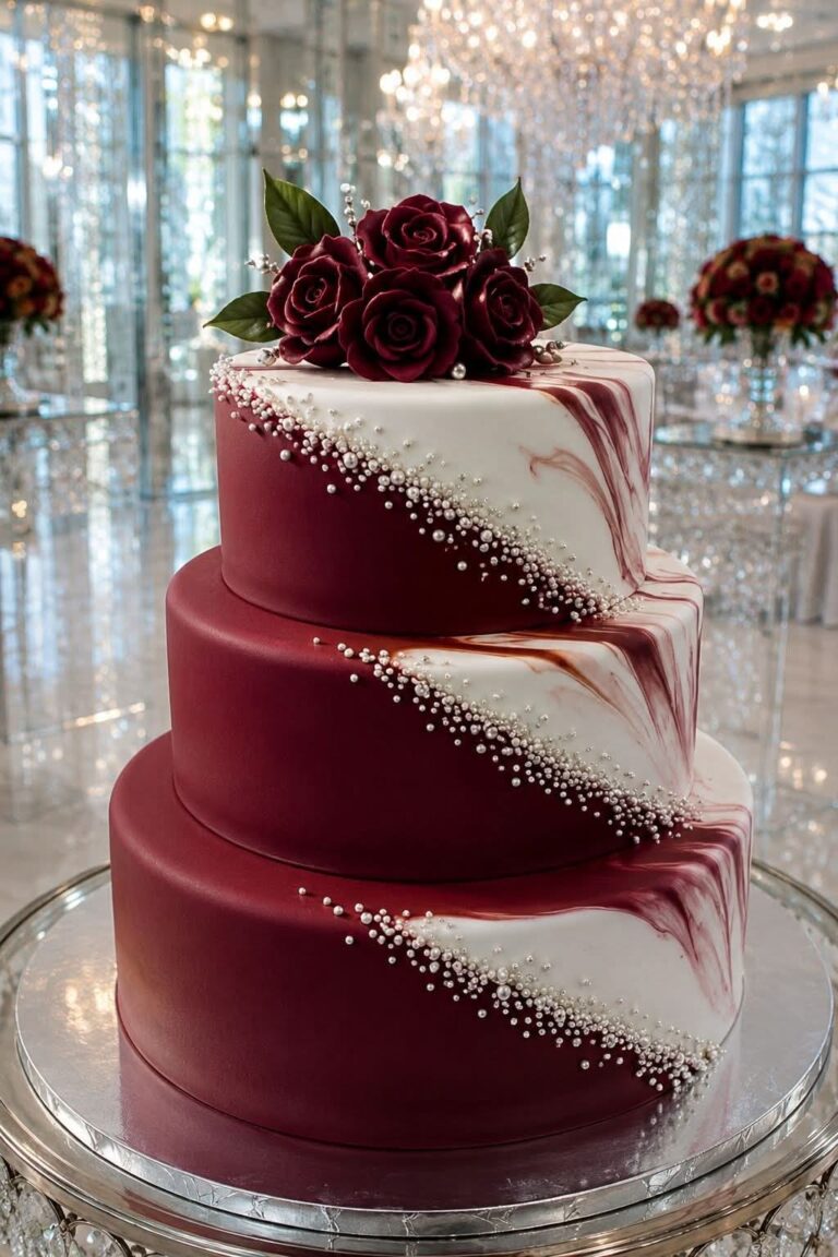
21. Burgundy and Gold
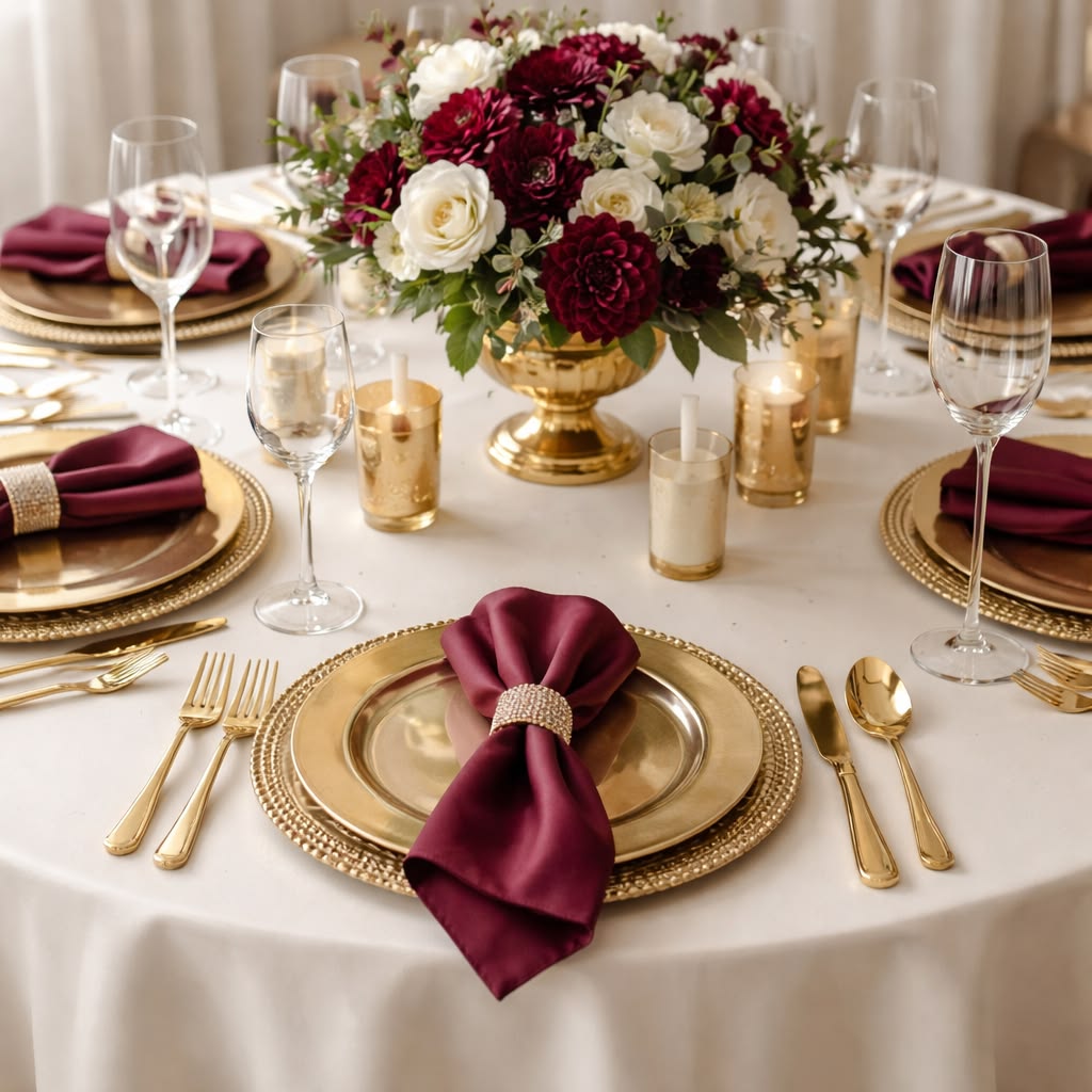
Burgundy and gold create a rich, elegant palette that suits autumn weddings.
Use burgundy flowers, gold candle holders, and warm table linens to bring the colors together.
Ivory accents can soften the combination and keep it from feeling too dark.
22. Burnt Orange and Cream
Burnt orange and cream capture the warmth of autumn while maintaining a romantic feel.
Introduce burnt orange through flowers, bridesmaid dresses, or table runners, then balance it with cream linens and neutral decorations.
This palette works beautifully for rustic barns and outdoor celebrations.
23. Rust and Sage Green
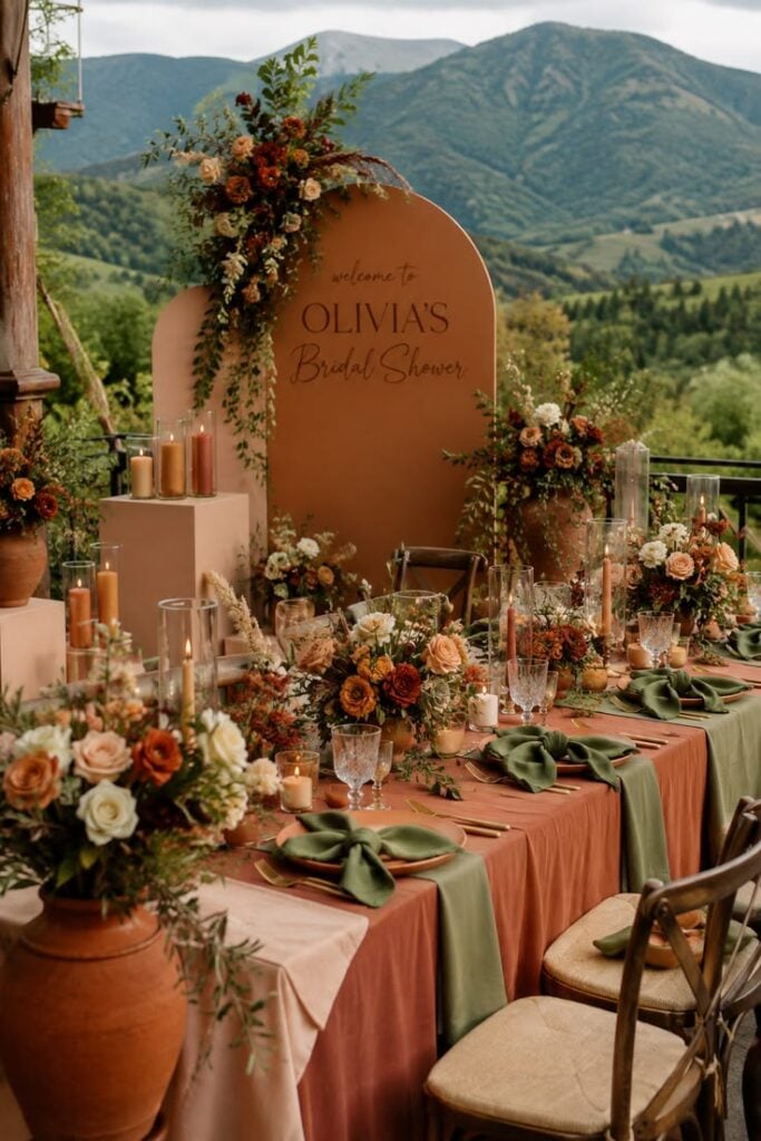
Rust and sage green create a natural palette inspired by autumn leaves and greenery. Use rust-colored flowers or fabric alongside sage table details and foliage.
The combination feels warm without relying entirely on dark colors.
24. Plum and Dusty Rose
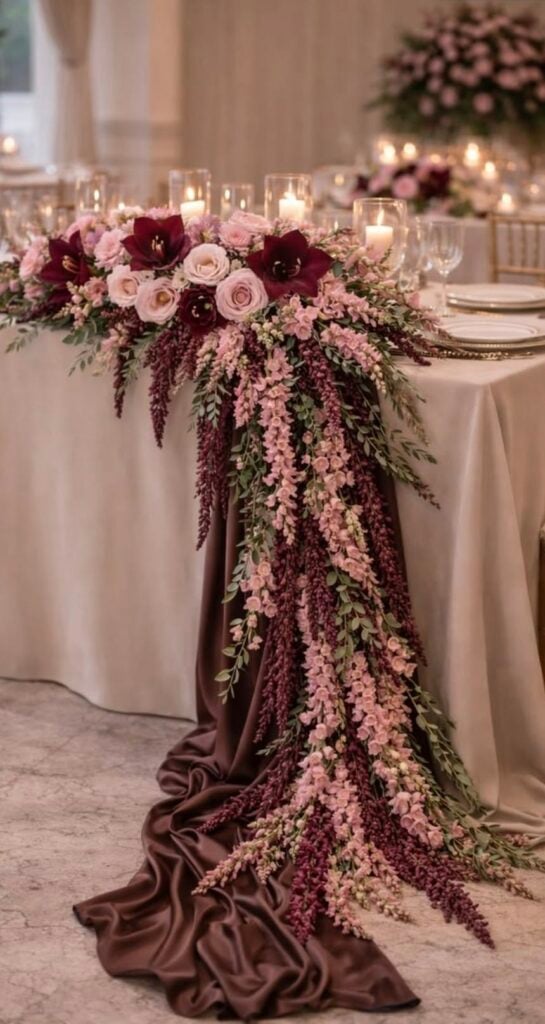
A rich plum shade pairs beautifully with the softness of dusty rose. Use plum for bridesmaid dresses or table accents, then introduce dusty rose through your floral arrangements.
Add cream details to keep the overall look balanced.
25. Chocolate Brown and Champagne
Chocolate brown and champagne create a warm, sophisticated palette for autumn celebrations.
Use brown in stationery, wooden details, or table accents, then introduce champagne through linens and metallic decorations. Soft white flowers can brighten the arrangement.
26. Terracotta and Olive Green
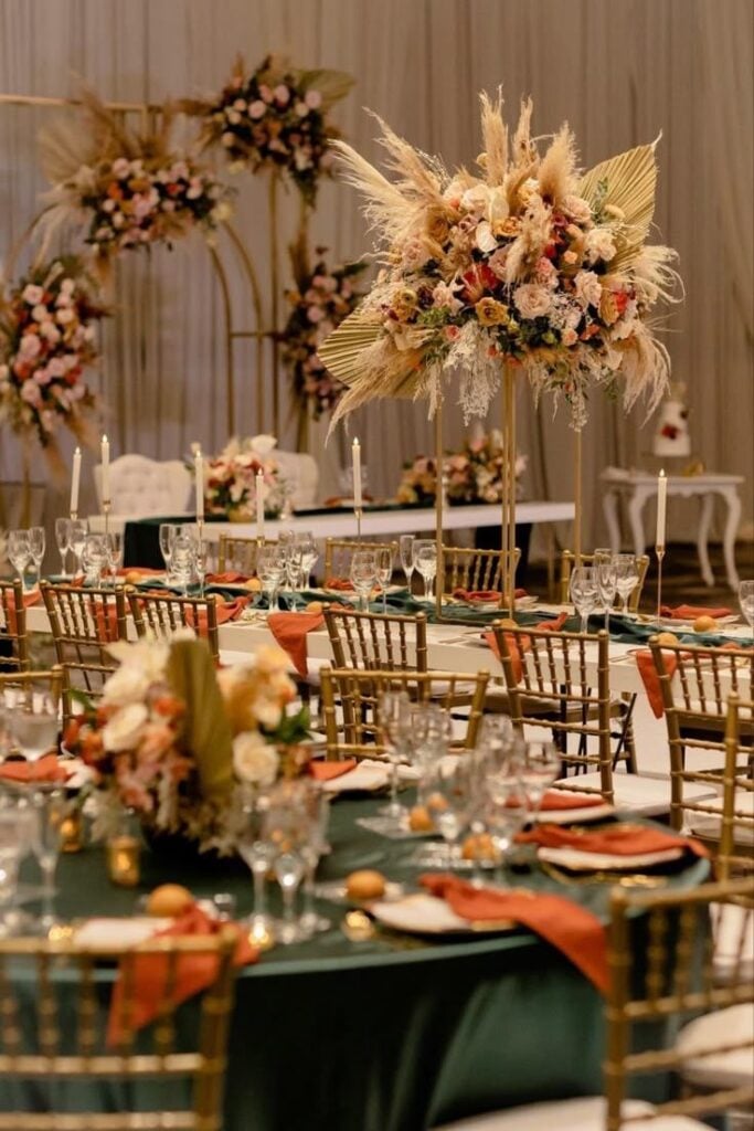
Earthy colors can give an autumn wedding a warm, natural feel.
Terracotta adds warmth to the decor, while olive green brings a fresh touch through foliage, dresses, and table decorations. Cream or beige accents can complete the palette.
27. Mustard Yellow and Burgundy
Mustard yellow and burgundy create a bold combination inspired by autumn foliage.
Use mustard as an accent rather than the main color, pairing it with burgundy flowers or deeper fabric details. Neutral table settings can keep the palette from looking too busy.
28. Forest Green and Copper
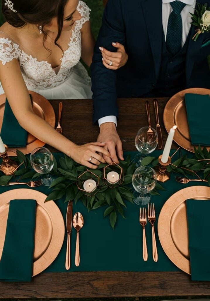
Forest green and copper create a rich palette that feels especially beautiful in autumn venues.
Use forest green in linens or bridesmaid dresses and add copper through candle holders, frames, or table accessories. Warm lighting can bring out the depth of both colors.
29. Mauve and Taupe
Mauve and taupe offer a muted, elegant alternative to traditional autumn colors. These shades work well for bridesmaid dresses, floral arrangements, and stationery.
Add ivory or soft greenery for a little contrast.
30. Navy Blue and Burnt Orange
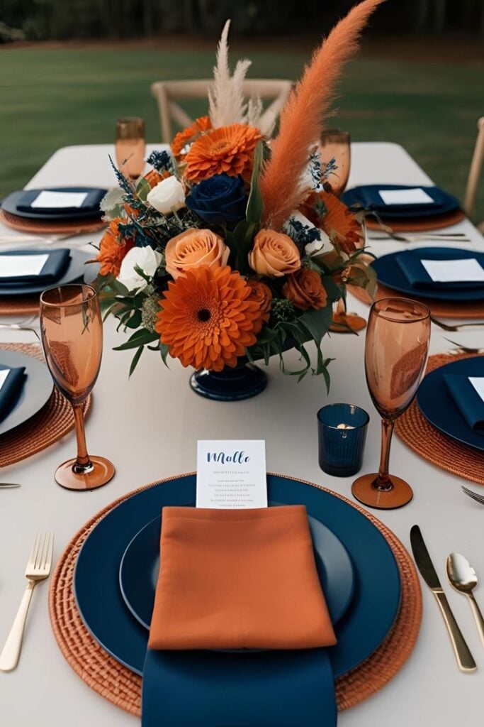
For a striking autumn palette, combine a deep navy shade with warm burnt orange.
Navy works well for suits, stationery, and table details. Meanwhile, burnt orange adds energy through flowers and decorative accents.. Keep the remaining decor simple so both shades stand out.
Winter Wedding Color Palettes
31. Emerald Green and Ivory
Emerald green and ivory create a timeless winter wedding palette.
Use emerald in table linens, bridesmaid dresses, or foliage, then soften the look with ivory flowers and candles. Gold details can add a subtle touch of glamour.
32. Burgundy and Blush Pink
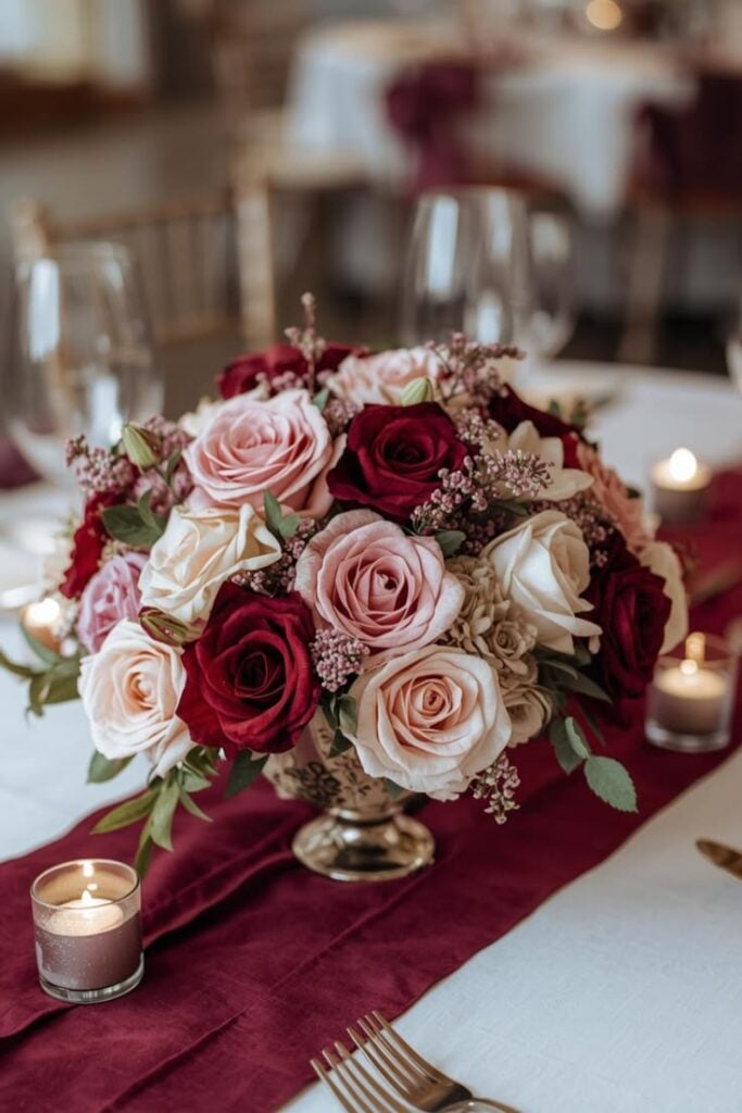
Burgundy and blush pink combine richness with softness, making them suitable for romantic winter celebrations.
Use burgundy in bouquets or table accents and blush pink for flowers and smaller decorative details. Cream linens can tie the two colors together.
33. Black and Champagne
Black and champagne create a polished palette for a formal evening reception.
Use black sparingly through stationery, napkins, or table details, then introduce champagne with metallic accents and warm lighting. White flowers can help keep the room from feeling too dark.
34. Navy Blue and Silver
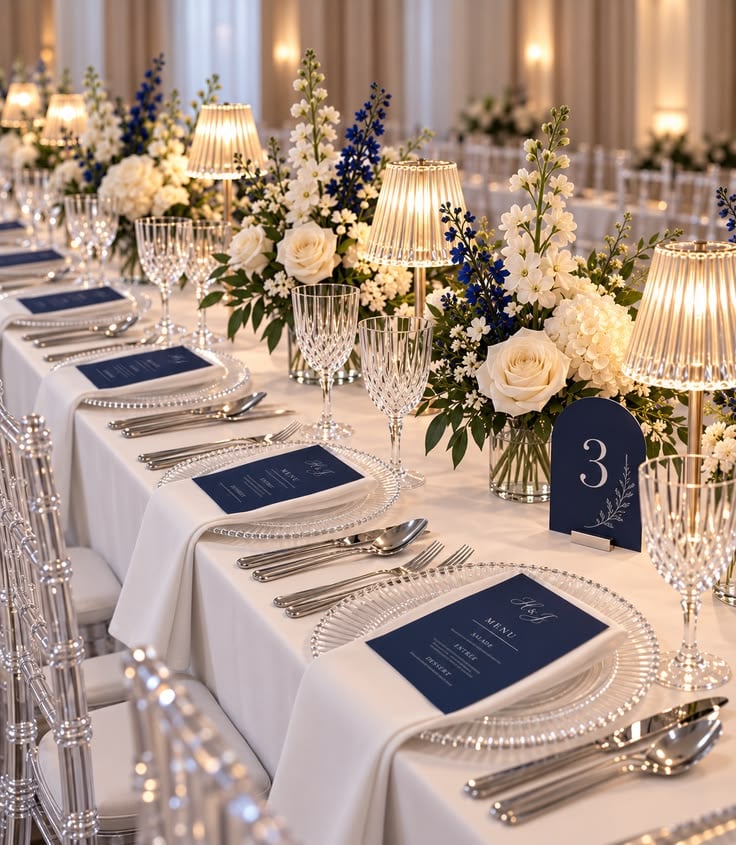
Create a cool, sophisticated look by pairing deep navy with shimmering silver details. Use navy for table linens or stationery, then introduce silver through candle holders and cutlery.
White flowers can brighten the arrangement and complete this elegant winter palette.
35. Plum and Gold
Plum and gold offer a dramatic palette for couples who want a luxurious winter celebration.
Use plum in floral arrangements or fabric details and add gold accents through tableware and decorative frames. Balance the richness with soft lighting and a few neutral elements.
36. Dusty Blue and Grey
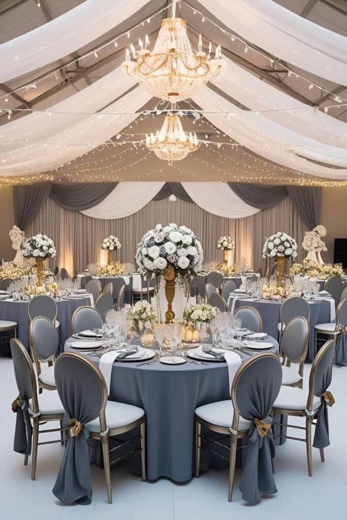
Dusty blue and grey create a calm, understated winter palette. Use dusty blue for dresses, flowers, or stationery, then incorporate grey through linens and table details.
White accents can make the overall design feel fresh.
37. Forest Green and Burgundy
Forest green and burgundy bring depth and warmth to winter wedding decor. Combine greenery with burgundy flowers and use neutral linens to prevent the colors from overwhelming the space.
This palette works particularly well in traditional venues and candlelit receptions.
38. White and Gold
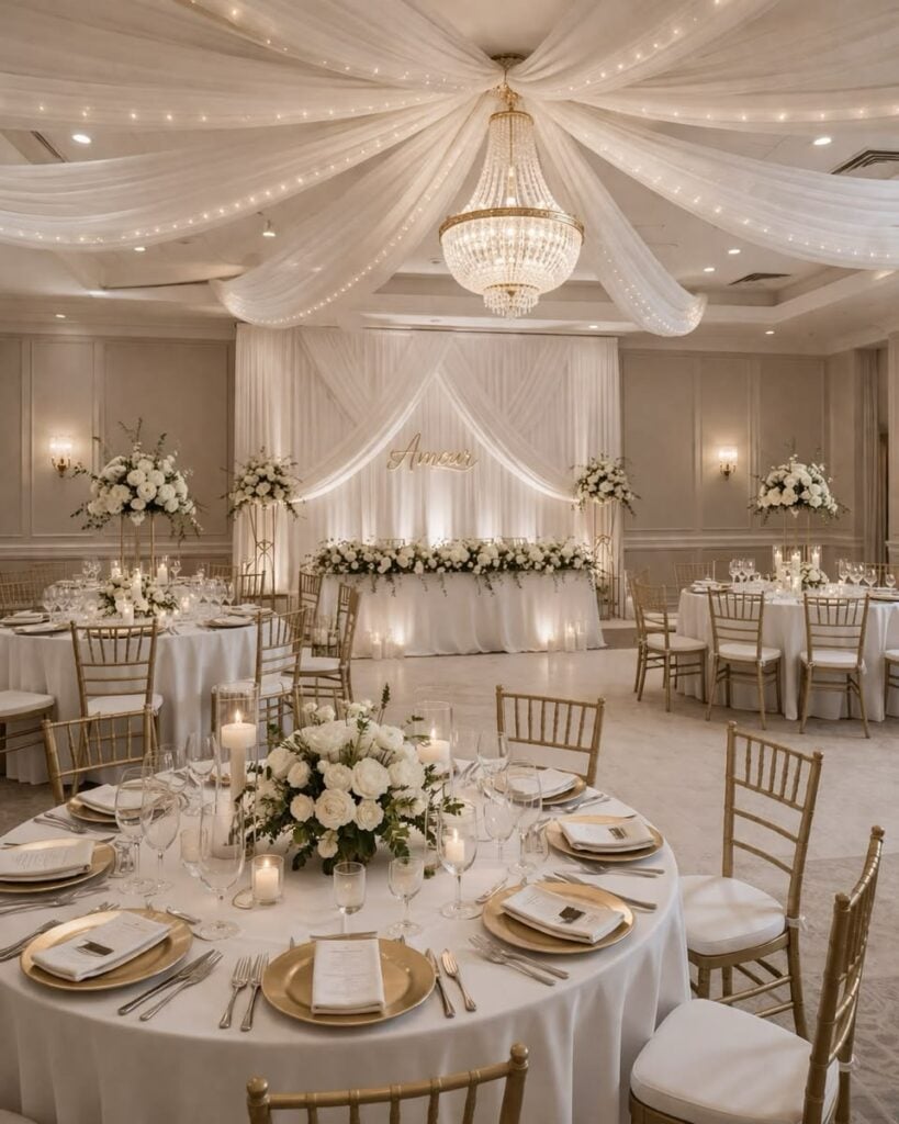
White and gold create a classic palette that feels bright and elegant throughout the winter season.
Use white flowers and linens as the foundation, then introduce gold through table settings, candle holders, and signage. Keep the metallic details consistent for a polished finish.
39. Ice Blue and Silver
Ice blue and silver create a cool palette inspired by winter frost. Incorporate ice blue into the flowers, stationery, or table decorations and use silver accents to add a subtle shimmer.
White details help the combination feel cohesive.
40. Charcoal Grey and Blush
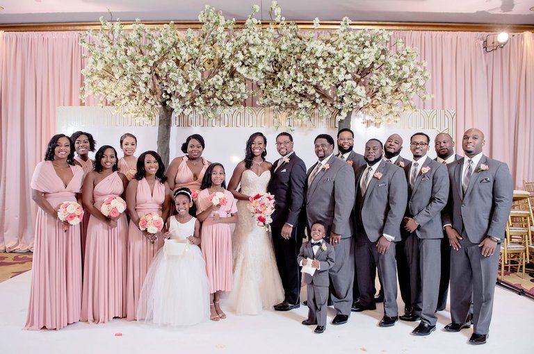
Charcoal grey and blush offer a modern balance between a deep neutral and a soft romantic shade. Use charcoal in suits, stationery, or table accents, then introduce blush through flowers and linens.
A little ivory can brighten the overall palette.
For ideas on coordinating your wedding stationery with your chosen colors, explore Wedding Invitation Wording Examples.
Matching the style of your invitations to your palette can help create a consistent look from the first announcement to the reception.
Wedding Color Palettes for Different Styles
41. Rose Gold and Ivory
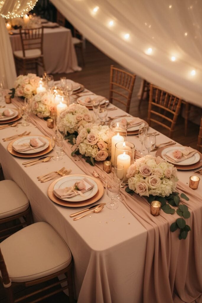
Rose gold and ivory create a romantic palette with a subtle touch of glamour.
Use ivory linens as your foundation, then introduce rose gold through candle holders, table numbers, and cutlery. Soft pink flowers can bring the colors together beautifully.
42. Dusty Blue and Champagne
A dusty blue and champagne combination feels elegant without being too formal.
Dress your bridesmaids in dusty blue and incorporate champagne into your table settings and stationery. Ivory flowers can add a soft finishing touch.
43. Burgundy and Navy Blue
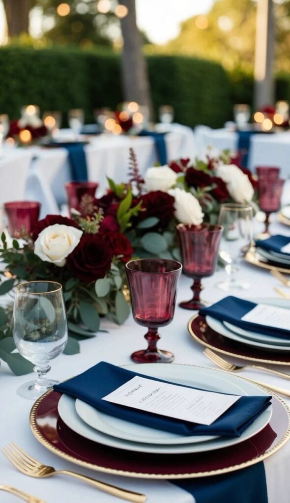
Deep colors can create a striking look for a formal wedding celebration. Combine burgundy flowers with navy blue suits, table accents, or stationery.
Add cream details to balance the richness of the palette.
44. Peach and Sage Green
Peach and sage green bring a fresh, natural feeling to a wedding.
Use peach flowers alongside sage greenery, or introduce both shades through your table decorations. This combination suits garden venues and outdoor celebrations.
45. Mauve and Champagne
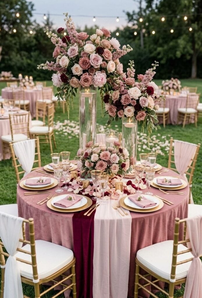
Mauve and champagne create a soft, sophisticated palette that works throughout the year.
Incorporate mauve into your bridesmaid dresses and floral arrangements, then use champagne for linens and decorative accents. A little greenery can keep the design from feeling too formal.
46. Black and White
A black and white palette offers a timeless option for couples who prefer a clean, classic look.
Use white flowers and linens alongside black stationery, chairs, or table details. Metallic accents can add another layer of elegance without taking away from the simplicity.
47. Coral and Sage Green
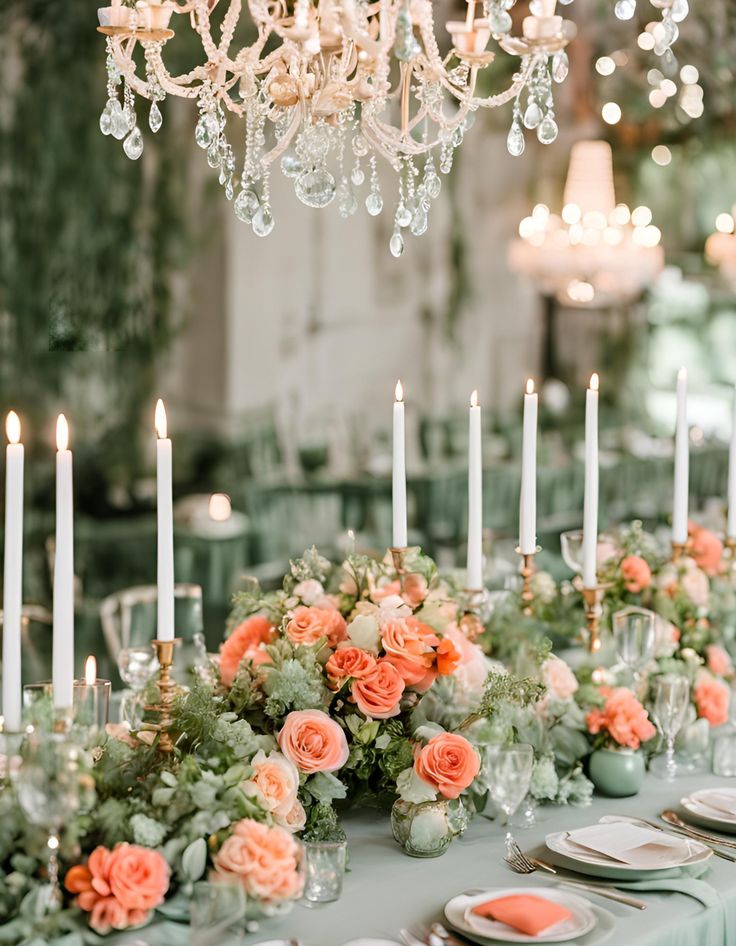
Coral brings warmth and brightness, while sage green provides a natural balance.
Use coral in bouquets and smaller decorative details, then introduce sage through foliage and table runners. This combination is particularly lovely for spring and summer weddings.
48. Champagne and Dusty Rose
Champagne and dusty rose create a romantic palette with a gentle, luxurious feel.
Use champagne for the table linens and metallic details, then add dusty rose through flowers and bridesmaid dresses. The combination works beautifully in both indoor and outdoor venues.
49. Forest Green and Cream
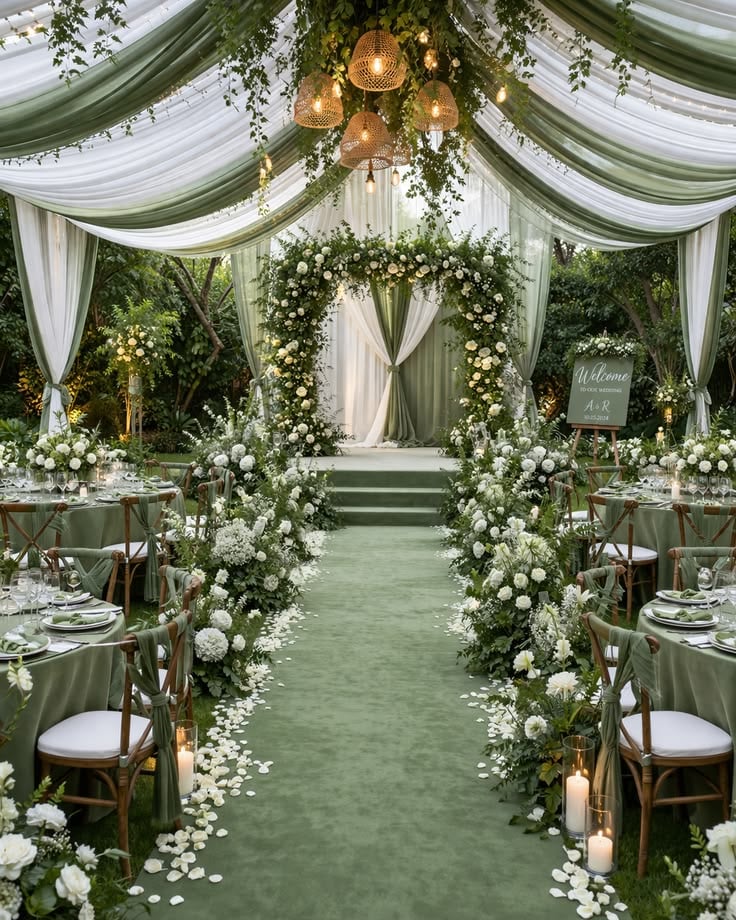
Forest green and cream create a rich yet natural wedding palette.
Incorporate deep green through foliage, table runners, or bridesmaid dresses, then soften the look with cream flowers and linens. Wooden details can add warmth to rustic venues.
50. Lilac and Butter Yellow
Lilac and butter yellow bring a cheerful, delicate touch to spring and summer celebrations.
Use lilac flowers with pale yellow accents in the table settings or stationery.
Keep the remaining decor simple so the colors remain the main attraction.
Wedding Color Palettes With a Modern Feel
51. Mocha Brown and Ivory
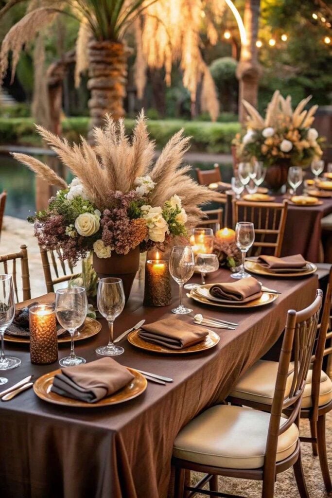
Mocha brown and ivory create a warm, understated palette for a modern wedding. Use brown in the stationery, table runners, or bridesmaid dresses, then balance it with ivory flowers and linens.
This combination suits minimalist celebrations and elegant indoor receptions.
52. Blue and Soft Grey
Soft grey gives blue a calm, sophisticated appearance. Choose dusty or powder blue for the main color and use grey in the table settings, suits, or stationery.
White flowers can brighten the overall design.
53. Emerald Green and Blush Pink
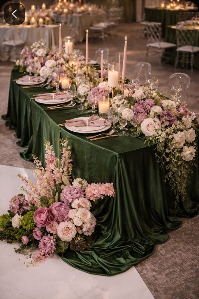
Emerald green adds depth, while blush pink softens the overall look. Introduce green through dresses or foliage and use blush flowers to create contrast.
Gold accents can add a little extra glamour to the reception.
54. Rust and Cream
Rust and cream create an inviting palette inspired by warm autumn tones.
Use rust-colored flowers, table runners, or stationery alongside cream linens and neutral decorations. The result feels elegant without requiring many different colors.
55. Plum and Champagne
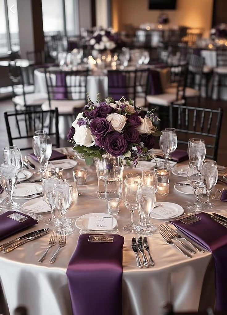
Plum brings richness to a wedding palette, while champagne adds a soft, refined finish.
Use plum for floral arrangements or decorative details, then introduce champagne through tableware and linens. This combination works especially well for evening celebrations.
56. Olive Green and Beige
Olive green and beige are ideal for couples who love understated, natural wedding colors.
Incorporate olive through foliage, dresses, and table runners, then use beige for linens and stationery.
Wooden accents can make the overall design feel warm and cohesive.
57. Copper and Dusty Blue
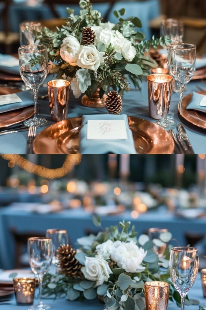
Copper and dusty blue offer an interesting mix of warmth and coolness.
Use dusty blue for dresses or table details, then add copper through candle holders, frames, or decorative accessories.
Keep the metallic elements consistent for a polished appearance.
58. Wine Red and Ivory
Wine red and ivory create a romantic palette with a timeless feel.
Use wine red in your flowers, napkins, or bridesmaid dresses, then balance it with ivory tablecloths and arrangements.
This combination works beautifully for autumn and winter weddings.
59. Soft Pink and Grey
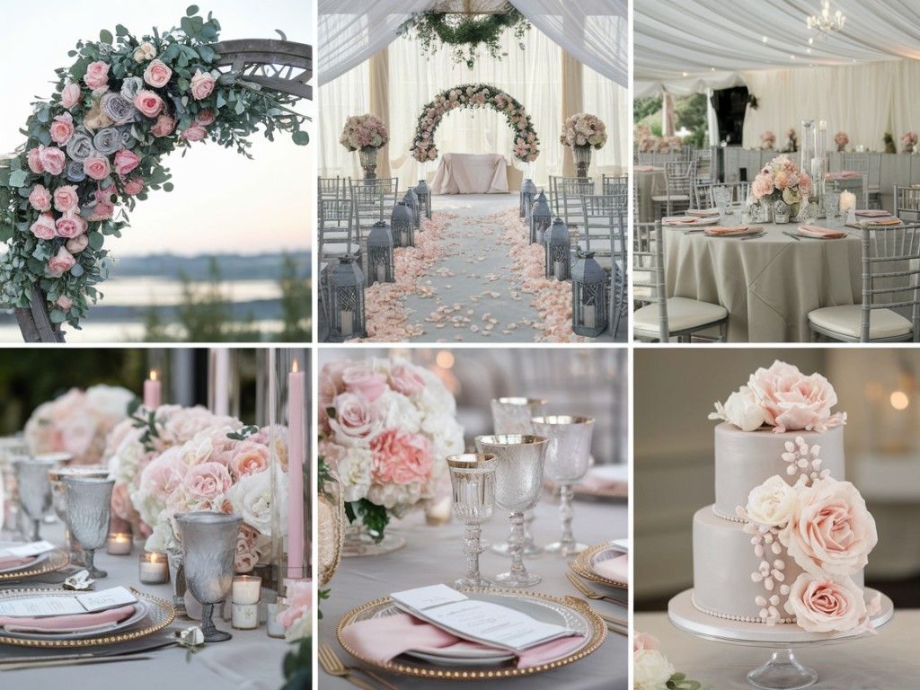
Soft pink and grey offer a gentle, modern alternative to traditional pink wedding palettes.
Incorporate pink through flowers and smaller decorative details, then use grey for suits, stationery, or table accents.
White elements can brighten the arrangement.
60. Champagne, White, and Gold
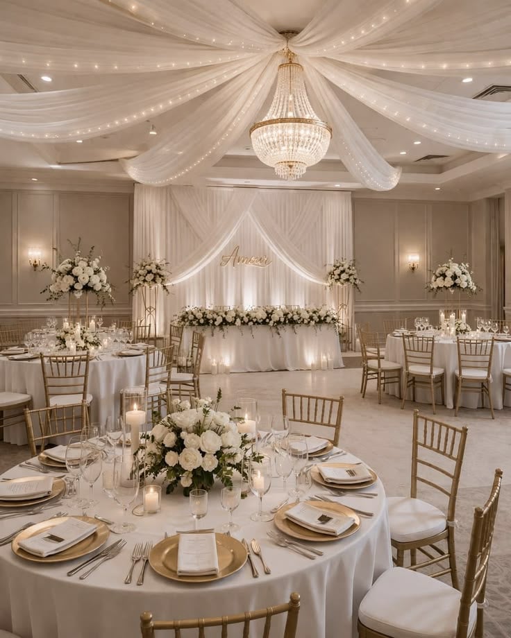
For a classic luxury look, combine champagne, white, and gold throughout your wedding decor.
White flowers and linens provide a clean foundation, while champagne fabrics and gold accents add warmth.
Repeat these colors across your stationery, centerpieces, and table settings for a coordinated celebration.
Final Thoughts
Your wedding color palette should reflect the atmosphere you want to create, whether that means soft spring pastels, bright summer shades, rich autumn tones, or elegant winter colors.
Choose two or three main colors and repeat them throughout your flowers, outfits, stationery, and reception decor. For more inspiration on bringing everything together, revisit 100 Elegant Wedding Decor Ideas You’ll Want to Save and select decorations that complement your chosen shades.
You do not need to follow every seasonal trend to create a beautiful wedding. Choose colors you genuinely love, consider your venue and lighting, and keep the overall design consistent. With a thoughtful palette, even simple decorations can make your celebration feel special and memorable.